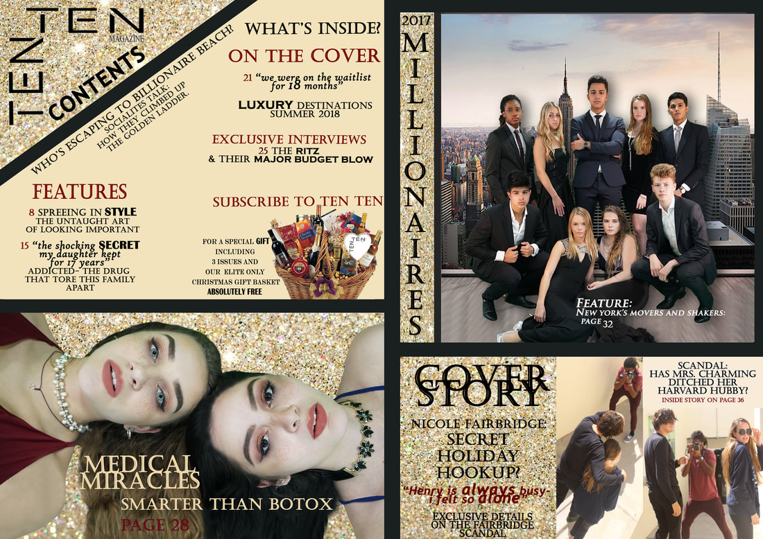
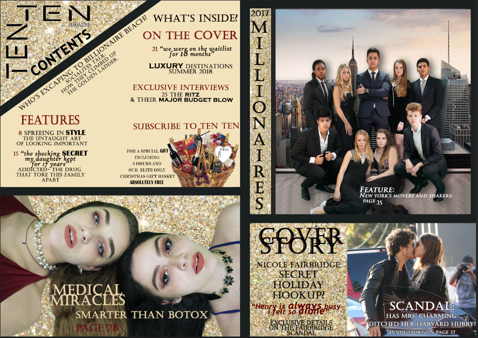
FINAL CONTENTS PAGE
initial ideas
In order to maintain my house style I decided to use the same:
- colour scheme
- text
-themes of sell lines
- colour scheme
- text
-themes of sell lines
layout
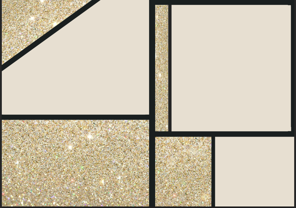
I decided to use an interesting layout with different sections and dividers. I did this in order to give the impression that my magazine has multiple 'features'. I began creating my layout on Photoshop by using the rectangle tools. I then found a glitter background and used it in the corner of my contents page where the name of my magazine, 'TEN TEN' was going to be. In order to emphasize my house style and theme of luxury further, I decided to use this same glitter background in other areas of my contents page.
choosing photos

Reasons for this photo:
- The angle of the camera is interesting and resonates with common codes and conventions within beauty advertising.
- The models are both engaging in direct address which instantly attracts the reader to the story.
- The lighting is bright and there are not many shadows to correct
Reasons against this photo:
- It will be very difficult to remove the background behind the models' hair.
- I will need to remove the strap on my model's arm.
Despite the possible difficulties, I decided to continue with this image on my contents page as I believe that it carry my theme of luxury effectively with the upper class representation created.
I was eager to use this photo in my contents page as I had to discard it for my cover page after all of my editing and correction.
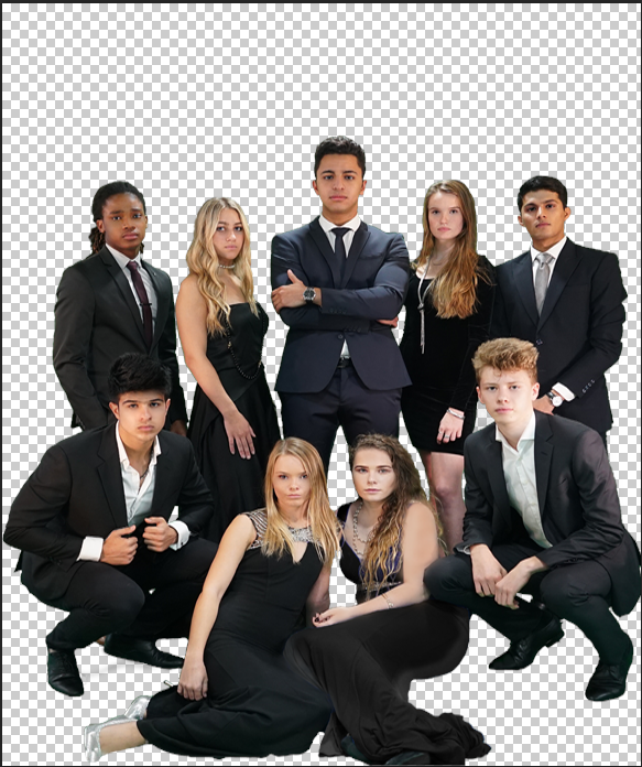
Reasons for:
- All of the models had strong eye focus creating direct address
- Good positioning of the models and levels
- The lighting was effective and shadows were minimal
- Representation of both gender and ethnicity Is carried effectively
Reasons against:
- Difficult to Photoshop and remove background due to fine details
- Many faces and features to correct
- I may have to correct the blue dress to make it black for a more cohesive cover.

Representation of Race and Ethnicity:
I decided to research how ethnicity is represented within magazines in order to further support the chosen models within my images. I studied a 'CONTENT ANALYSIS OF MAGAZINE ADVERTISING' that focused on the 'RACE & GENDER STEREOTYPES' within magazines. https://honors.libraries.psu.edu/files/final_submissions/178
(note: coloured text includes sections I researched further and took into account whilst choosing my models and Images.)
Research has shown the racial representation of advertising models to be dependent upon magazine type. The over- or underrepresentation of particular racial groups is often reflective of the type of magazine in which they are featured. Within the sample, racial representation and magazine type proved to have a statistically significant dependent relationship, Χ2(8, N = 211) = 124.40, p = .000. Therefore, the total racial representation percentages of the sample were not proportionate to the population because they were a combination of the three different magazine categories. Once magazines were broken down by category, the racial representation percentages become more comparable to their actual population percentages.
Focusing solely on women’s magazines, Caucasian women represented 77.1 percent of the category which is over representative in comparison to their 65.9 population percentage. African American and Hispanic American women were also underrepresented in the women’s magazine category, being depicted in only 8.5 percent and 4.8 percent of the advertisements respectively. Asian American women were depicted in 4.7 percent of the ads making them the only racial group with accurate representation in women’s magazine category. These results correlate with the results of various past studies of women’s magazines which demonstrated the habitual overrepresentation of Caucasian Americans and under representation of minority groups.
"Various past studies of women's magazines demonstrated the habitual overrepresentation of Caucasian Americans and under representation of minority groups" This point is the overarching reason for the choices of my images. The 2 images I chose for my contents page represent multiple ethnic minorities and groups including Caucasian, Asian, African American and middle eastern.
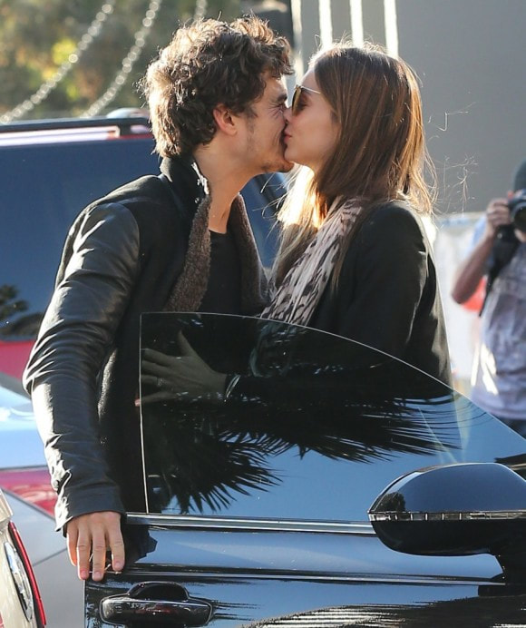
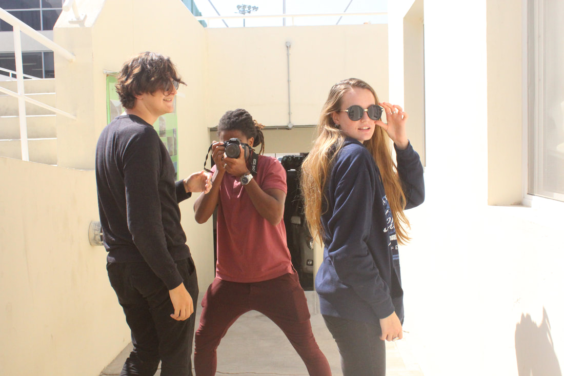
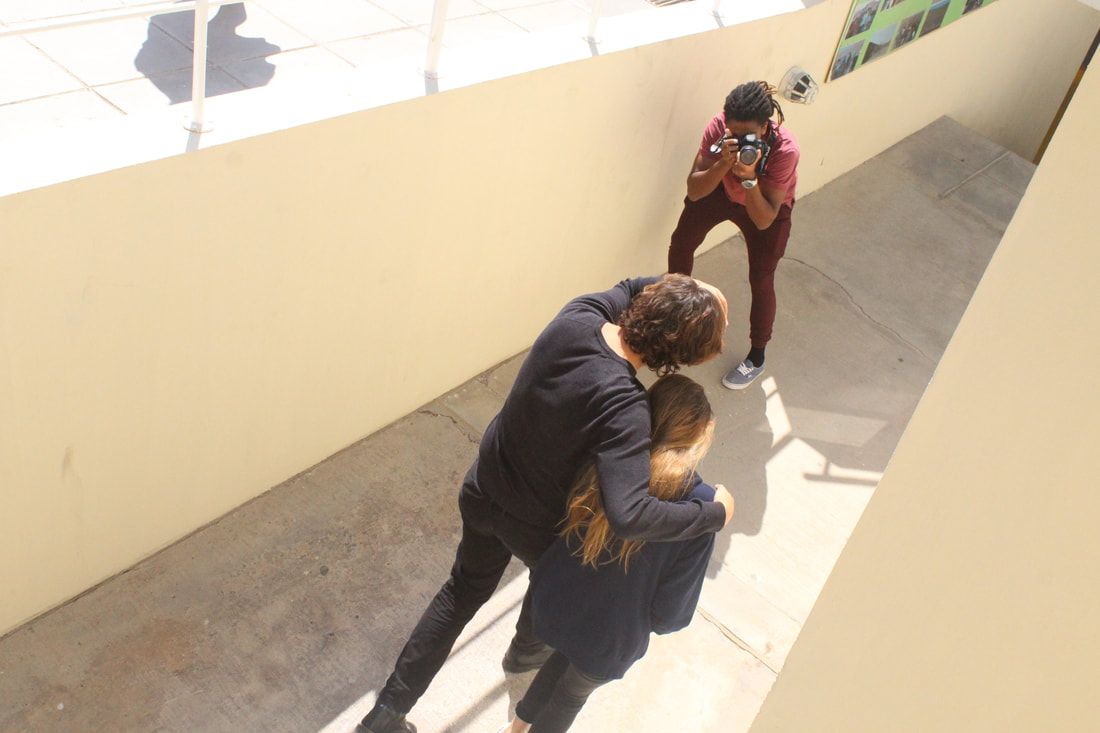
This is an online photo of a paparazzi shot of 2 celebrities, I use this picture as inspiration for my image (that I have not taken yet).
editing on Photoshop

|

|
Steps:
- Whilst removing the background, I found much difficulty in removing the green background behind my models' hair as shown above. For this, I used the clone stamp tool in order to clone certain areas of the hair which were not green.
- I used this tool again when removing the strap on my model's shoulder.
- In order to make the image appear more 'cohesive', I used the patch tool in order to copy the freckles from one model to another. This step was difficult at first but after some research into how to effectively make facial changes on Photoshop, I managed to put natural looking freckles on the model in my image.
- In order to carry the cohesive theme throughout, I used the eye dropper tool and brush tool together in order to change the lipstick on my model.
- To remove imperfections, I used the healing brush tool over the model's faces.
- Finally I used the sharpen tool in order to emphasise the eyes on my models in the image with the intention of making the reader more attracted to the image as a result of the direct address.
|
|
|
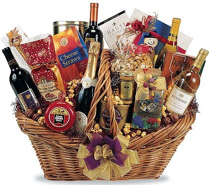
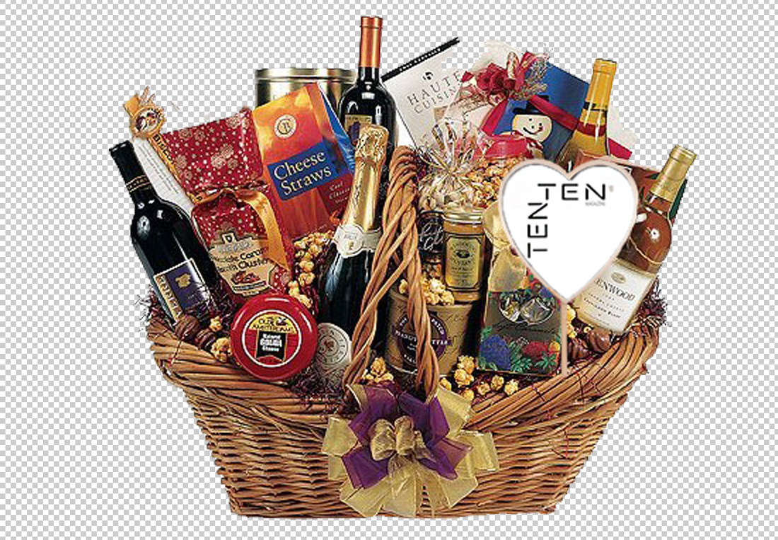
Improving my Photoshop skills further, I created a gift basket for my contents page and included a 'TENTEN MAGAZINE' tag that I created on Photoshop in order to improve the realism.
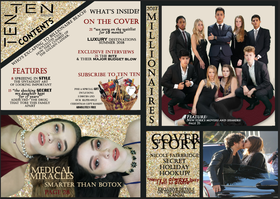
I also received feedback from my teacher who suggested that my background image of the top right image on my contents page should be altered.
With this feedback I decided to use the same background for this image as the background on my cover page. I did this as the models on my cover page also appear on this image on my contents page, so would make logical sense that they reappear in the same location. Furthermore, it will allow my House Style to be reinforced as I am carrying a consistent theme from my Front cover to Article, which will improve the cohesiveness of my Magazine.
With this feedback I decided to use the same background for this image as the background on my cover page. I did this as the models on my cover page also appear on this image on my contents page, so would make logical sense that they reappear in the same location. Furthermore, it will allow my House Style to be reinforced as I am carrying a consistent theme from my Front cover to Article, which will improve the cohesiveness of my Magazine.

|
|
|
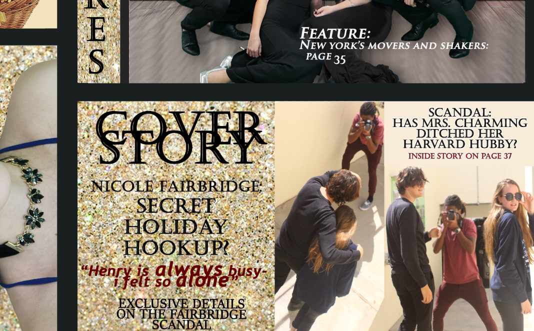
My final step was to change the 'paparazzi' picture in the bottom right corner of my contents page to my own image that mimicked the temporary image. I wanted all of my photography on my magazine to be my own in order to showcase originality and in order to develop my photography and editing skills.

